Overview:
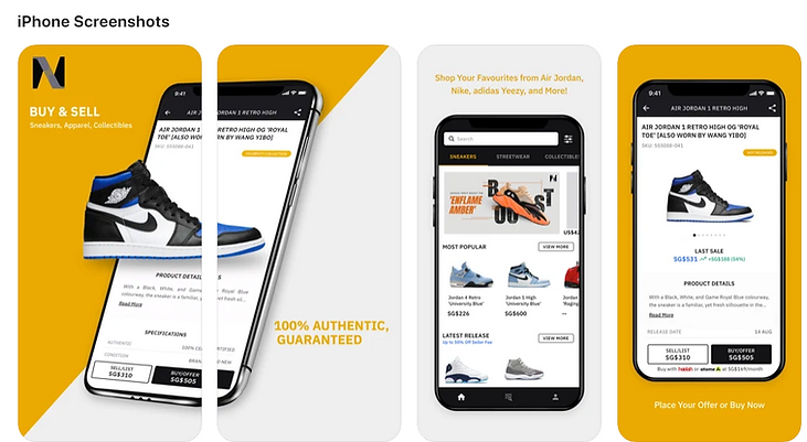
Novelship is a two-sided marketplace connecting buyers and sellers of sneakers in the Southeast Asia and APAC region. Worked with designer, engineers, marketing team to launch Novelship’s first iOS app in short period of five months. Achieving #11 Shopping Category app and 4.9 app store star rating.
Role: Led project as lead PM, UX designer, QA.
Goals:
-
Improve branding image/legitimacy of Novelship.
-
Improve reach of service to a wider target audience thru app stores distribution.
-
Improve our engagement for bidding for both current/new buyers and sellers.
Metrics:
-
Achieved #11 Shopping Category in SG, AU, MY at peak
-
16,000 app installs within 2 weeks launch
-
4.9/5.0 App Store Star Rating
Novelship App Launch!
Product Solution:
-
The demo video shows a typical eCommerce flow but with the twist : the user is able to browse for products on the homepage, he may choose to use the search browse filter function to narrow his findings. After he is able to browse the product listing and proceed to checkout. He may check his order history for shipment status or bidding updates.
-
Launched with checkout flow for buying/selling, push notifications, order history dashboard, profiles page, homepage, search-browse filters, promotions.
-
2 Key product/UX decisions were made as highlighted in the screenshots and slideshow below.
-
Homepage-Lite
-
Dashboard
-


UX Decisions: (Pls read slides)
-
2 Key product/UX decisions were made as highlighted in the screenshots and slideshow below.
-
Homepage-Lite, Dashboard
Key Takeaways:
-
React Native: Native App Developers are costly to hire and high in demand. It is far easier to develop the Novelship app using React native, as most of our developers were already versed in web languages (Javascript) and our core modules and API were already created. Only some effort was required to adapt features to work on iOS and Android interfaces. This also makes it more sustainable for the long run as the same server-side feature code can be used across mobile web, iOS, Android. Therefore, shortening cross platform feature rollout and keeping the engineering team lean.
-
App UX: To maximize app mass adoption and reduce design/tech efforts, stick to UX already present in mobile web version that’s proven and familiar with current users. The value proposition and stickiness reasons were uncovered during interviews.
-
Usability Testing : Figma Prototype is as good as the real live app. When product team are conflicted, 3 design variations with pros and cons was shared with testers to tie-break with great effect. Competitor Screenshots can be shown as supporting evidence.
-
Stakeholder Buy In: Constant Update Reports and planned project phases key to getting full support of stakeholders for project resources and buy in.
-
Minimum Loveable Product: First Iteration of Apps only needs to be minimum loveable product with basic necessities such as order confirmation, homepage, product listing, checkout where users feel some upside value versus web version.
-
Quick Hacks: Clever use of in-app mobile web browser gives users ‘illusion’ of complete feature set whilst keeping project scope lean and development efforts for native features saved for only absolutely necessary fundamental features (buying, dashboard, product pages).


Story & Reflections:
This project is the key strategic objective in the Novelship corporate roadmap for 2021 as the company seeks to consolidate on the SG, MY, AU, NZ markets. The greatest challenge of the project was due to a tight timeline, limited tech resources and it being the first time the product-engineering team made a mobile app.
Firstly, due to the timeline of fundraising schedule, the C-suite wanted a fully realized mobile app by May 2021. This resulted in feature set bloat so we needed to cut to only the essentials, hence allowing us to focus on the Minimum Loveable Product. We were able to alleviate stakeholder anxiety by showing planned phases to show how/when exactly we were going to deliver value, dev man hour efforts required by each user story (giving flexibility to cut down features) and proactively giving project updates.
Secondly, the tech team was also stretched between still maintaining the current web features and the mobile app. There were still web features requiring maintenance causing distraction. This was solved by showing C-Suite multiple scenarios (best, middle, worst) and it was then later agreed that we would spend 80-20 time working on the app. The CTO and myself also had almost daily catchups to discuss challenges and alignment on the feature roadmap.
Thirdly, we were also facing team inexperience with making mobile app. It was many team member’s first time developing a mobile app and it is an intimidating task. In this project, many of us experienced an exponential growth in our project management, time planning, coding and UX skills. The CTO, Vignesh and I would spend many hours researching on competitor’s apps, best practices for mobile app, talking to customers. Personally myself, I have spent my career only maintaining some individual modules or features, but never an entire application altogether in one project.
As a PM, I needed to have ruthless prioritization to cut down on scope and to grow my stakeholder management skills as this was a high stakes and resource intensive project. Furthermore, due to resource constraints, we needed to engage with a UI designer contractor and this definitely grew my UX skills and knowledge as I needed to be the UX designer here, working with my junior PMs to conduct usability testing, customer interviews and brainstorm UX solutions. I definitely grew my FIGMA skills and UX knowledge by ten folds as I worked on this project.